Photoshop Practice
For our production, we need to create a DigiPak in order to advertise our song/album/artist in a print format. The DigiPak has to show intertextuality and a solid knowledge of both photographic and photo editing techniques. As a result of the latter, we decided to do some experimentation within Adobe Photoshop to see if my own knowledge could be strengthened and whether we could get some inspiration for a final product. We took an existing stock image and applied different effects to it, as discussed below.
-Original Image-
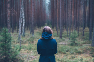
This is the original image. It depicts a woman standing centre frame inside a forest. I wanted to see what I could do to the photo to accentuate the subject, which is the woman, and how I could improve the overall look of the picture itself - through techniques like colour grading. To start, I drew a mask around the subject and duplicated the layer, so that I could apply effects to the background that had no effect on the subject herself.
-Gaussian Blur-
For this example, I applied a Gaussian Blur with intensity of around 34. This allowed for the blur to the background. As a result of the aforementioned masking, the subject is still in focus; but now a lot more prominently due to the contrast between the focal lengths. It also allows a contrast between the green and red colours of the forest and the deep blue of the coat - which looks a lot more detailed than in the original photo. Finally, it dims out the light at the top of the frame, but not on the woman, which could connote ideas of beauty and life.
-Crystalise-
For this example I used the render effect crystalise, again with an intensity of around 20. What this effect does is turn the surroundings into little hexagon shapes. The higher the intensity, the bigger the squares and the simpler the frame looks. It takes on an almost artistic quality. I chose smaller shapes as when using the bigger shapes everything kind of melded together, whereas here you can still make out the forest but it is done more pointalistically. Once again, the subject stands out against the artistic background, which connotes the divide between artistic impression and natural beauty.
-Colour Grading-
For the final image I decided to really accentuate colour by changing saturation, hue, highlights and adding a lens flare. The lens flare is shown at the stop of the screen, making the light shine brighter. The colour changes I made was to accentuate blue and green, with the former being focused on as I believe the blue coat is the most important part of the frame. The change to colour also affected the red trees, making them stand out a bit more. The changes to the picture make for a more bright and aesthetically pleasing image, however it does make it look more unnatural (which contrasts the subject matter of the image itself).
-Timelapse Of Practicing-
This is a full time lapse for all our practice, which took around an hour. You can see some other effects and techniques we chose not to use, including spotlight lighting effects (as shown in the thumbnail) and the usage of objects, which is why at one point there is a tree in centre frame. This practice allowed me to look through all the stock effects available to me in photoshop, and to plan out what we could and could not use in our DigiPak.


Comments
Post a Comment